Hands-on wxPython
Andrea Gavana - PythonBrasil8
Who Am I

I am a Senior Reservoir Engineer at Maersk Oil in Copenhagen, Denmark, where I mix a 10-years reservoir engineering knowledge with the power of Python and its libraries to solve many everyday problems arising during the numerical studies of oil and gas fields.
I am the author and the maintainer of the AGW (Advanced Generic Widgets) library for wxPython, a large collection of owner-drawn and custom widgets shipped officially with every new release of wxPython.
Contacts:
- E-mail: andrea.gavana@gmail.com
- Twitter: @AndreaGavana
Tutorial Description
This tutorial is a quick introduction to wxPython, divided in two parts:
- Installation and configuration
- Build a skeleton of a wxPython application
- Window layout management with Sizers
- Learn how to use the most common core widgets
- Basics of creating custom controls with wxPython
- “Free style” coding - depending on time
Sources are available here. Figures are in the figures directory and all scripts are located in the scripts directory. The tutorial is also online at my web page.
 Tutorial location
- Full tutorial (zipped - RECOMMENDED): http://bit.ly/TgyfRN
- Online version: http://bit.ly/TdeKq0
- Zipped archive of scripts: http://bit.ly/T5YzdL
All code and material is licensed under a Creative Commons Attribution 3.0 United States License (CC-by) http://creativecommons.org/licenses/by/3.0/us
Introduction
wxPython is one of the most famous frameworks used to build graphical user interfaces (GUIs) in Python. It provides native look and feel widgets on all supported platforms (Windows, Linux/Unix, Mac) and it has a vast repository of owner-drawn controls. In addition, the wxPython demo is the place where to start looking for examples and source code snippets.
Code editors
If you plan to run the various scripts available in this tutorial directly from your preferred editor, you should check that it does not interfere with the wxPython event loop. Eclipse, Wingware IDE, Editra, Ulipad, Dr. Python and newest versions of IDLE (and many other editors) support this functionality. If your preferred editor does not - you can easily find out by running the Hello World sample and see if it hangs - you can still run the samples via the command line:
$ python hello_world.py
Documentation
This tutorial contains many links to the documentation referring to the next generation of wxPython - codenamed Phoenix. The reasons behind this choice are:
- The quality of the Phoenix documentation is much higher
- Backward-incompatibilities between Phoenix and the previous versions of wxPython are relatively few
- Phoenix is going to take over the world in a few months :-)
Installation and Configuration
Windows Binaries
Choose an installer that matches the version of Python you will be using. If you are using a 64-bit version of Python then make sure you also get a 64-bit wxPython, otherwise choose a 32-bit installer even if you are on a 64-bit version of Windows. There is no longer a separate ansi and Unicode build, it’s all Unicode now.
| Installer | Architecture |
|---|---|
| wxPython2.9-win32-py26 | 32-bit Python 2.6 |
| wxPython2.9-win64-py26 | 64-bit Python 2.6 |
| wxPython2.9-win32-py27 | 32-bit Python 2.7 |
| wxPython2.9-win64-py27 | 64-bit Python 2.7 |
wxPython Demo for Windows
This installer contains the infamous wxPython demo, other samples, and wxWidgets documentation.
Mac OSX Binaries
The wxPython binaries for OSX are mountable disk images. Simply double click to mount the image and then run the installer application in the image. Be sure to download the image that matches the version of Python that you want to use it with. The files with “carbon” in the name use the Carbon API for implementing the GUI, are compatible with PPC and i386 machines are will work on OSX 10.4 and onwards. The file with “cocoa” in the name use the Cocoa API for implementing the GUI, requires at least OSX 10.5, and supports either 32-bit or 64-bit architectures.
wxPython Demo for Mac OSX
These disk images contain the wxPython demo, the documentation, some other samples and some tools:
Linux Binaries
To get prebuilt binaries for Linux or other platforms, please search in your distro’s package repository, or any 3rd party repositories that may be available to you. Ubuntu users can get information about the the wx APT repository here. If all else fails you can build wxPython yourself from the source code, see the build instructions.
A First Application
In this section, we are going to build step by step a skeleton of a wxPython application, enriching it incrementally. Every sub-section contains one or more exercises for you to familiarize yourself with the wxPython framework.
Hello World
 Documentation
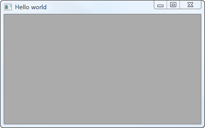
As in (almost) all every other language and library, this is the simplest “Hello World” application you can write in wxPython:
# In every wxPython application, we must import the wx library
import wx

# Create an application class instance
app = wx.App()

# Create a frame (i.e., a floating top-level window)
frame = wx.Frame(None, -1, 'Hello world')

# Show the frame on screen
frame.Show()

# Enter the application main loop
app.MainLoop()
The last line enters what wxPython defines as “MainLoop”. A “MainLoop” is an endless cycle that catches up all events coming up to your application. It is an integral part of any windows GUI application.
Although the code is very simple, you can do a lot of things with your window. You can maximize it, minimize it, move it, resize it. All these things have been already done for you by the framework.
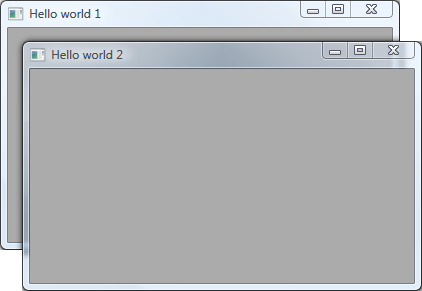
Exercises
Using the Hello World sample:
- Modify it to create two frames instead of one, setting their title as “Hello 1” and “Hello 2”.
- Using the modified script in (1), make the second frame a child of the first.
Observe what happens in (1) and (2) when you close the first frame. Does the application terminate?
Click on the figure for the solution.
Menubar and statusbar
Documentation
Almost all the applications sport a menu bar and a status bar in their main window.
A menu bar is a very powerful tool to let the user interact with your GUI as it displays (various levels of) cascading menus with multiple options.
A status bar is a narrow window that can be placed along the bottom of a frame and it is mostly used to give small amounts of status information.
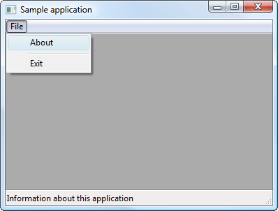
import wx

class MainWindow(wx.Frame):

    def __init__(self, parent, title):

        wx.Frame.__init__(self, parent, title=title)

        # A Statusbar in the bottom of the window
        self.CreateStatusBar()

        # Setting up the menu
        file_menu = wx.Menu()

        # wx.ID_ABOUT and wx.ID_EXIT are standard IDs provided
        # by wxWidgets.
        file_menu.Append(wx.ID_ABOUT, '&About',
                         'Information about this application')
        file_menu.AppendSeparator()
        file_menu.Append(wx.ID_EXIT, 'E&xit', 'Exit the application')

        # Creating the menubar
        menu_bar = wx.MenuBar()

        # Adding the 'file_menu' to the menu bar
        menu_bar.Append(file_menu, '&File')

        # Adding the menu bar to the frame content
        self.SetMenuBar(menu_bar)
        self.Show()

app = wx.App(False)
frame = MainWindow(None, 'Sample application')
app.MainLoop()
Notice the wx.ID_ABOUT and wx.ID_EXIT ids. These are standard ids provided by wxWidgets (see a full list here). It is a good habit to use the standard ID if there is one available. This helps wxPython know how to display the widget in each platform to make it look more native.
 Hints
Hints
- For part (2) you will need to use the SetStatusWidths and SetStatusText methods.
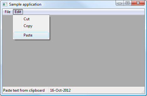
Exercises
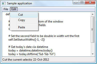
Using the MenuBar and StatusBar sample:
- Modify it to add an “Edit” top menu with “Cut”, “Copy” and “Paste” sub-menus.
- Create a status bar with 2 fields, set the second field to have double width with respect to the first and and display today’s date in the second field.
Click on the figure for the solution.
Event handling
Documentation
Reacting to events in wxPython is called event handling. An event is when “something” happens on your application (a button click, text input, mouse movement, a timer expires, etc...). Much of GUI programming consists of responding to events.
You link a wxPython object to an event using the Bind() method:
class MainWindow(wx.Frame):

    def __init__(self, parent, title):

        wx.Frame.__init__(self, parent, title=title)

        # Other stuff...

        menu_item = file_menu.Append(wx.ID_EXIT, 'E&xit', 'Exit the application')
        self.Bind(wx.EVT_MENU, self.OnExit, menu_item)
This means that, from now on, when the user selects the “Exit” menu item, the method OnExit will be executed. wx.EVT_MENU is the “select menu item” event. wxPython understands many other events (everything that starts with EVT_ in the wx namespace).
The OnExit method has the general declaration:
def OnExit(self, event):

    # Close the frame, cannot be vetoed if force=True
    self.Close(force=True)
Here event is an instance of a subclass of wx.Event. For example, a button-click event - wx.EVT_BUTTON - is a subclass of wx.Event.
Working with events is straightforward in wxPython. There are three steps:
- Identify the event binder name: wx.EVT_BUTTON, wx.EVT_CLOSE, etc...
- Create an event handler. It is a method called when an event is generated
- Bind an event to an event handler
Sometimes we need to stop processing an event: for example, think about a user closing your main application window while the GUI still contains unsaved data. To do this, we call the method Veto() on an event, inside an event handler:
class MainWindow(wx.Frame):

    def __init__(self, parent, title):

        wx.Frame.__init__(self, parent, title=title)

        # Other stuff...

        self.Bind(wx.EVT_CLOSE, self.OnClose)


def OnClose(self, event):

    # This displays a message box asking the user to confirm
    # she wants to quit the application
    dlg = wx.MessageDialog(self, 'Are you sure you want to quit?', 'Question',
                           wx.YES_NO | wx.NO_DEFAULT | wx.ICON_QUESTION)

    if dlg.ShowModal() == wx.ID_YES:
        self.Destroy()
    else:
        event.Veto()
Adding widgets
Documentation
We are going to add an editable text box inside our frame (a wx.TextCtrl). By default, a text box is a single-line field, but the wx.TE_MULTILINE parameter allows you to enter multiple lines of text.
class MainWindow(wx.Frame):

    def __init__(self, parent, title):

        wx.Frame.__init__(self, parent, title=title)

        self.control = wx.TextCtrl(self, style=wx.TE_MULTILINE)
A couple of things to notice:
- The text box is a child of the frame.
- When a frame frame has exactly one child window, not counting the status and toolbar, this child is resized to take the entire frame client area.
We can create a link between the wx.TextCtrl behaviour and the menu selected by the user by binding menu events (like “Cut”, “Copy” and “Paste” menu selections) to the main frame and process the results in an event handler. For example:
class MainWindow(wx.Frame):

    def __init__(self, parent, title):

        wx.Frame.__init__(self, parent, title=title)

        self.control = wx.TextCtrl(self, style=wx.TE_MULTILINE)

        # Other stuff, menubar creation, etc...

        # Bind the "copy menu event" to the OnCopy method
        self.Bind(wx.EVT_MENU, self.OnCopy, id=wx.ID_COPY)


    def OnCopy(self, event):

        # See if we can copy from the text box...
        if self.control.CanCopy():
            # Actually copy the wx.TextCtrl content
            # into the clipboard
            self.control.Copy()
In the OnCopy event handler we simply check if we can copy text from the text box (i.e., if something is selected and can be copied to the clipboard) and we actually copy what is selected into the clipboard.
Hints
Exercises
Using the Widgets sample:
- The “Edit” top menu has the “Cut”, “Copy” and “Paste” sub-menus: bind the correct events to the main frame and add event handlers for these menus.
- Check that you can copy/paste text to/from another application (i.e., a word processor or an IDE).
- Look at another implementation of the Widgets sample: what did I do differently?
Click on the figure for the solution.
Window Layout Management
Layout management: describes how widgets are laid out in an application’s user interface.
wxPython provides a few alternatives:
- Absolute positioning (brute force): don’t. No, really, don’t;
- Sizers: very powerful, not so simple at the beginning, but worth the effort;
- SizedControls: add-on library to help simplify the creation of sizer-based layouts;
- AUI (Advanced User Interface): docking windows and automatic layout management.
Why sizers?
Sizers, as represented by the wx.Sizer class and its descendants in the wxPython class hierarchy, have become the method of choice to define the layout of controls in parent windows because of their ability to create visually appealing frames independent of the platform, taking into account the differences in size and style of the individual controls.
The idea behind sizers
The layout algorithm used by sizers in wxPython is closely related to layout systems in other GUI toolkits, such as Java’s AWT, the GTK toolkit or the Qt toolkit. It is based upon the idea of individual subwindows reporting their minimal required size and their ability to get stretched if the size of the parent window has changed. This will most often mean that the programmer does not set the start-up size of a window, the window will rather be assigned a sizer and this sizer will be queried about the recommended size.
This sizer in turn will query its children (which can be normal windows, empty space or other sizers) so that a hierarchy of sizers can be constructed.
 Note
Note
wx.Sizer does not derive from wx.Window and thus does not interfere with tab ordering and requires very few resources compared to a real window on screen.
What makes sizers so well fitted for use in wxPython is the fact that every control reports its own minimal size and the algorithm can handle differences in font sizes or different window sizes on different platforms without problems.
For example, if the standard font as well as the overall design of Linux/GTK widgets requires more space than on Windows, the initial window size will automatically be bigger on Linux/GTK than on Windows.
There are currently 6 different kinds of sizers available in wxPython:
Each represents a certain way to lay out window items or it fulfils a special task such as wrapping a static box around a window item (or another sizer).
Common features
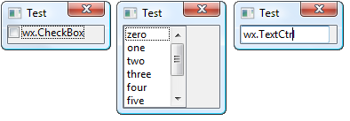
Note
Note that only some controls can calculate their size (such as a wx.CheckBox) whereas others (such as a wx.ListBox) don’t have any natural width or height and thus require an explicit size. Some controls can calculate their height, but not their width (e.g. a single line text control).
All sizers are containers, i.e. they are used to lay out one window item (or several window items), which they contain. Such items are sometimes referred to as the children of the sizer. Independent of how the individual sizers lay out their children, all children have certain features in common:
A minimal size: This minimal size is usually identical to the initial size of the controls and may either be set explicitly in the wx.Size field of the control constructor or may be calculated by wxPython, typically by setting the height and/or the width of the item to -1.
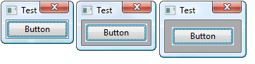
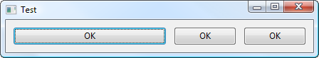
A border: The border is just empty space and is used to separate widgets in a parent window. This border can either be all around, or at any combination of sides such as only above and below the control. The thickness of this border must be set explicitly, typically 5 points. The following samples show frames with only one item (a button) and a border of 0, 5, and 10 pixels around the button:
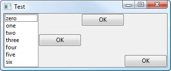
An alignment: Often, a widget is given more space than its minimal size plus its border. Depending on what flags are used for the respective widget, this widget can be made to fill out the available space entirely, i.e. it will grow to a size larger than the minimal size, or it will be moved to either the centre of the available space or to either side of the space. The following sample shows a listbox and three buttons in a horizontal box sizer; one button is centred, one is aligned at the top, one is aligned at the bottom:
A stretch factor: If a sizer contains more than one child and it is offered more space than its children and their borders need, the question arises how to distribute the surplus space among the children. For this purpose, a stretch factor (proportion) may be assigned to each child, where the default value of 0 indicates that the child will not get more space than its requested minimum size.
A value of more than zero is interpreted in relation to the sum of all stretch factors in the children of the respective sizer, i.e. if two children get a stretch factor of 1, they will get half the extra space each independent of whether one control has a minimal sizer inferior to the other or not. The following sample shows a frame with three buttons, the first one has a stretch factor of 1 and thus gets stretched, whereas the other two buttons have a stretch factor of zero and keep their initial width:
wx.Sizers - the visual approach
Basic way of adding a window
Let’s take a look at wx.BoxSizer. This is the most simple type of box sizer, and the way we add widgets to it is explained by looking at the wx.BoxSizer.Add signature:
- Add(window, proportion=0, flag=0, border=0, userData=None)
Appends a child to the sizer.
Parameters: - window – a window, a spacer or another sizer to be added to the sizer. Its initial size (either set explicitly by the user or calculated internally) is interpreted as the minimal and in many cases also the initial size.
- proportion (int) – this parameter is used in wx.BoxSizer to indicate if a child of a sizer can change its size in the main orientation of the wx.BoxSizer - where 0 stands for not changeable and a value of more than zero is interpreted relative to the value of other children of the same wx.BoxSizer. For example, you might have a horizontal wx.BoxSizer with three children, two of which are supposed to change their size with the sizer. Then the two stretchable windows would get a value of 1 each to make them grow and shrink equally with the sizer’s horizontal dimension.
- flag (int) – OR-combination of flags affecting sizer’s behaviour.
- border (int) – determines the border width, if the flag parameter is set to include any border flag.
- userData (object) – allows an extra object to be attached to the sizer item, for use in derived classes when sizing information is more complex than the proportion and flag will allow for.
Return type:
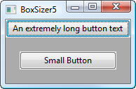
Let’s create a vertical sizer (children will be placed on top of each other) and place two buttons in it. All the “extra” parameters are set to 0; we’ll worry about them later.
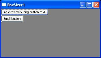
sizer = wx.BoxSizer(wx.VERTICAL)
sizer.Add(wx.Button(self, -1, 'An extremely long button text'), 0, 0, 0)
sizer.Add(wx.Button(self, -1, 'Small button'), 0, 0, 0)
self.SetSizer(sizer)
You’ll notice a couple of things about this:
- The buttons are just big enough to accommodate the text in them. In fact, any control placed into a sizer this way will appear at its minimum size unless we change the parameters.
- The window size is not changed to fit the sizer. This results in a lot of ugly empty space.
Let’s worry about the second issue first. To make the window size more appropriate, we can set the size hints to tell the enclosing window to adjust to the size of the sizer:
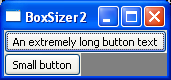
sizer = wx.BoxSizer(wx.VERTICAL)
sizer.Add(wx.Button(self, -1, 'An extremely long button text'), 0, 0, 0)
sizer.Add(wx.Button(self, -1, 'Small button'), 0, 0, 0)
sizer.SetSizeHints(self)
self.SetSizer(sizer)
This is particularly useful in circumstances like this one, in which the wx.Frame‘s default size would otherwise be much too big or small to show most layouts in an aesthetically pleasing manner.
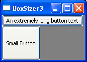
The proportion parameter
The first parameter to wx.BoxSizer.Add is obviously the wx.Window or wx.Sizer that you are adding. The second one (the proportion) defines how large the sizer’s children are in relation to each other. In a vertical sizer, this changes the height; in a horizontal sizer, this changes the width. Here are some examples:
| Code | Resulting Image |
|---|---|
sizer = wx.BoxSizer(wx.VERTICAL)
# Second button is three times as tall as first button
sizer.Add(wx.Button(self, -1, 'An extremely long button text'), 1, 0, 0)
sizer.Add(wx.Button(self, -1, 'Small button'), 3, 0, 0)
sizer.SetSizeHints(self)
self.SetSizer(sizer)
|
|
| Same code as above, with window resized. Notice that the bottom button is still three times as tall as the top button. | 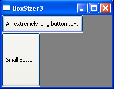
|
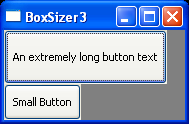
sizer = wx.BoxSizer(wx.VERTICAL)
# First button is 3/2 the height of the second button
sizer.Add(wx.Button(self, -1, 'An extremely long button text'), 3, 0, 0)
sizer.Add(wx.Button(self, -1, 'Small button'), 2, 0, 0)
sizer.SetSizeHints(self)
self.SetSizer(sizer)
|
|
If one of the proportion parameters is 0, that wx.Window will be the minimum size, and the others will resize proportionally:
| Code | Resulting Image |
|---|---|
sizer = wx.BoxSizer(wx.VERTICAL)
# Third button is twice the size of the second button
sizer.Add(wx.Button(self, -1, 'An extremely long button text'), 0, 0, 0)
sizer.Add(wx.Button(self, -1, 'Small button'), 1, 0, 0)
sizer.Add(wx.Button(self, -1, 'Another button'), 2, 0, 0)
sizer.SetSizeHints(self)
self.SetSizer(sizer)
|
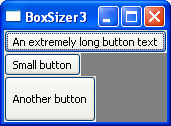
|
| Same code as above, with window resized. The top button (proportion 0) is still the minimum height, and the third button is still twice the height of the second. | 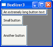
|
This is especially useful when you want, for example, a button at the bottom which is only as big as necessary, and some other control that occupies the rest of the frame. To do so, give the button proportion 0 and the other control a number greater than 0. Mac users in particular will appreciate you for not creating huge aqua-styled buttons.
The flags and border parameters
The flag argument accepted by wx.Sizer.Add is a OR-combination of the following flags. Two main behaviours are defined using these flags. One is the border around a window: the border parameter determines the border width whereas the flags given here determine which side(s) of the item that the border will be added. The other flags determine how the sizer item behaves when the space allotted to the sizer changes, and is somewhat dependent on the specific kind of sizer used.
| Sizer Flag | Description |
|---|---|
| wx.TOP | These flags are used to specify which side(s) of the sizer item the border width will apply to. |
| wx.BOTTOM | |
| wx.LEFT | |
| wx.RIGHT | |
| wx.ALL | |
| wx.EXPAND | The item will be expanded to fill the space assigned to the item. |
| wx.SHAPED | The item will be expanded as much as possible while also maintaining its aspect ratio |
| wx.FIXED_MINSIZE | If you would rather have a window item stay the size it started with then use FIXED_MINSIZE |
| wx.RESERVE_SPACE_EVEN_IF_HIDDEN | Normally Sizers don’t allocate space for hidden windows or other items. This flag overrides this behavior so that sufficient space is allocated for the window even if it isn’t visible. This makes it possible to dynamically show and hide controls without resizing parent dialog, for example. |
| wx.ALIGN_CENTER or wx.ALIGN_CENTRE | The ALIGN* flags allow you to specify the alignment of the item within the space allotted to it by the sizer, adjusted for the border if any. |
| wx.ALIGN_LEFT | |
| wx.ALIGN_RIGHT | |
| wx.ALIGN_TOP | |
| wx.ALIGN_BOTTOM | |
| wx.ALIGN_CENTER_VERTICAL or wx.ALIGN_CENTRE_VERTICAL | |
| wx.ALIGN_CENTER_HORIZONTAL or wx.ALIGN_CENTRE_HORIZONTAL |
Let’s start with the simplest case: the alignment flags. These are pretty self-explanatory.
| Code | Resulting Image |
|---|---|
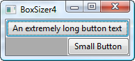
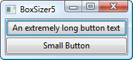
sizer = wx.BoxSizer(wx.VERTICAL)
# Second button is right aligned
sizer.Add(wx.Button(self, -1, "An extremely long button text"), 0, 0, 0)
sizer.Add(wx.Button(self, -1, "Small Button"), 0, wx.ALIGN_RIGHT, 0)
sizer.SetSizeHints(self)
self.SetSizer(sizer)
|
|
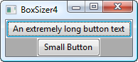
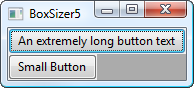
sizer = wx.BoxSizer(wx.VERTICAL)
# Second button is center-aligned
sizer.Add(wx.Button(self, -1, "An extremely long button text"), 0, 0, 0)
sizer.Add(wx.Button(self, -1, "Small Button"), 0, wx.ALIGN_CENTER, 0)
sizer.SetSizeHints(self)
self.SetSizer(sizer)
|
|
Next is the wx.EXPAND flag. This is synonymous with wx.GROW.
| Code | Resulting Image |
|---|---|
sizer = wx.BoxSizer(wx.VERTICAL)
# Second button expands to the whole parent's width
sizer.Add(wx.Button(self, -1, "An extremely long button text"), 0, 0, 0)
sizer.Add(wx.Button(self, -1, "Small Button"), 0, wx.EXPAND, 0)
sizer.SetSizeHints(self)
self.SetSizer(sizer)
|
|
You can see that the first button takes its minimum size, and the second one grows to match it. This affects controls in the opposite manner of the second parameter; wx.EXPAND in a vertical sizer causes horizontal expansion, and in a horizontal sizer it causes vertical expansion.
Next is wx.SHAPED. This flag ensures that the width and height of the object stay proportional to each other. It doesn’t make much sense for buttons, but can be excellent for bitmaps, which would be contorted or clipped if not scaled proportionally.
| Code | Resulting Image |
|---|---|
sizer = wx.BoxSizer(wx.VERTICAL)
# Second button will scale proportionally
sizer.Add(wx.Button(self, -1, "An extremely long button text"), 0, 0, 0)
sizer.Add(wx.Button(self, -1, "Small Button"), 1, wx.SHAPED, 0)
sizer.SetSizeHints(self)
self.SetSizer(sizer)
|
|
| Same code as above, with window resized. The width grew dramatically with the height. In fact, it didn’t quite grow vertically the whole way because it couldn’t maintain the correct ratio while doing so. | 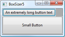
|
Finally, we have the border flags. These only make sense when the border parameter is greater than 0, and describe the sides of the control on which the border should appear. In order to demonstrate this most clearly, we’ll keep the wx.EXPAND flag.
| Code | Resulting Image |
|---|---|
sizer = wx.BoxSizer(wx.VERTICAL)
# Border size effects
sizer.Add(wx.Button(self, -1, "An extremely long button text"), 0, 0, 0)
sizer.Add(wx.Button(self, -1, "Small Button"), 0, wx.EXPAND | wx.LEFT, 20)
sizer.SetSizeHints(self)
self.SetSizer(sizer)
|
|
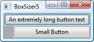
sizer = wx.BoxSizer(wx.VERTICAL)
# Border size effects
sizer.Add(wx.Button(self, -1, "An extremely long button text"), 0, 0, 0)
sizer.Add(wx.Button(self, -1, "Small Button"), 0, wx.EXPAND | wx.LEFT | wx.RIGHT, 20)
sizer.SetSizeHints(self)
self.SetSizer(sizer)
|
|
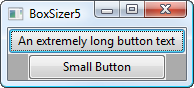
sizer = wx.BoxSizer(wx.VERTICAL)
# Border size effects
sizer.Add(wx.Button(self, -1, "An extremely long button text"), 0, 0, 0)
sizer.Add(wx.Button(self, -1, "Small Button"), 0, wx.EXPAND | wx.LEFT | wx.RIGHT | wx.TOP, 20)
sizer.SetSizeHints(self)
self.SetSizer(sizer)
|
|
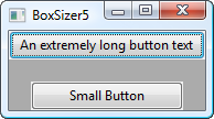
sizer = wx.BoxSizer(wx.VERTICAL)
# Border size effects
sizer.Add(wx.Button(self, -1, "An extremely long button text"), 0, 0, 0)
sizer.Add(wx.Button(self, -1, "Small Button"), 0, wx.EXPAND | wx.ALL, 20)
sizer.SetSizeHints(self)
self.SetSizer(sizer)
|
|
You can see that the button is offset from the specified edges of the sizer by the number of pixels that we specified in the border parameter.
Hints
- See wx.BoxSizer.Add and the wx.StaticText constructor
Exercises
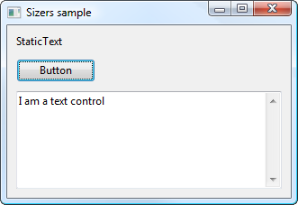
Starting from the Sizers sample:
- Modify it to add some aesthetically pleasing borders between the widgets (say, 10 pixels).
- Make the text control expand to fill all the remaining available space.
- Can you make the static text right-aligned?
Click on the figure for the solution.
Hints
- See the Wiki page on the Widget Inspection Tool, the docs on wx.CheckBox and wx.SpinCtrl constructors.
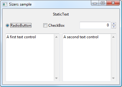
Exercises
Run the Sizers+ sample (without looking at the code!!), and The Widget Inspection Tool will pop up.
- Using the Widget Inspection Tool, can you work out what combination/hierarchy of sizers I have used for this sample? Which flags and borders did I use for all the widgets/sizers?
- Can you reproduce the layout I created?
Click on the figure for the solution.
Fonts, Colours and Bitmaps
This section will briefly show some basic information about graphic device interface objects, which include fonts, colours and bitmaps.
wx.Font
A font is an object which determines the appearance of text, primarily when drawing text to a window or device context. A wx.Font is determined by the following parameters (not all of them have to be specified, of course):
| Point size | This is the standard way of referring to text size. |
| Family | Supported families are: wx.DEFAULT, wx.DECORATIVE, wx.ROMAN, wx.SCRIPT, wx.SWISS, wx.MODERN. wx.MODERN is a fixed pitch font; the others are either fixed or variable pitch. |
| Style | The value can be wx.NORMAL, wx.SLANT or wx.ITALIC. |
| Weight | The value can be wx.NORMAL, wx.LIGHT or wx.BOLD. |
| Underlining | The value can be True or False. |
| Face name | An optional string specifying the actual typeface to be used. If None, a default typeface will chosen based on the family. |
| Encoding | The font encoding |
As an example, you can create a font object and assign it to a widget like this:
static_text = wx.StaticText(parent, -1, 'Some text here')

font1 = wx.Font(10, wx.SWISS, wx.ITALIC, wx.NORMAL)
static_text.SetFont(font1)

text_ctrl = wx.TextCtrl(parent, -1, 'Some other text')

# A font can be retrieved from the OS default font and modified
font2 = wx.SystemSettings.GetFont(wx.SYS_DEFAULT_GUI_FONT)
font2.SetPointSize(12)
text_ctrl.SetFont(font2)
wx.Colour
A colour is an object representing a combination of Red, Green, Blue and Alpha channel (RGBA) intensity values. Valid RGBA values are in the range 0 to 255.
There are three ways for setting colours. We can create a wx.Colour object, use a predefined colour name or use hex value string:
text_ctrl = wx.TextCtrl(parent, -1, 'Some text')

text_ctrl_SetBackgroundColour(wx.Colour(0, 0, 255))
# OR
text_ctrl_SetBackgroundColour('BLUE')
# OR
text_ctrl.SetBackgroundColour('#0000FF')
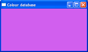
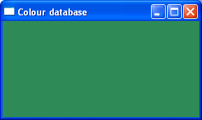
As an alternative, you can also use the handy colour database provided in the wx.lib.colourdb module and comprising more than 600 named colours:
import wx
import wx.lib.colourdb
import random

class MyFrame(wx.Frame):
    def __init__(self, parent):
        wx.Frame.__init__(self, parent, title='Colour database')

        # Show the selected colour in this panel
        panel = wx.Panel(self)

        wx.lib.colourdb.updateColourDB()
        # Create a colour list from the colourdb database
        colour_list = wx.lib.colourdb.getColourList()

        # Get one random colour between those 600 available
        random_colour = random.choice(colour_list)
        panel.SetBackgroundColour(random_colour)
wx.Bitmap
A bitmap is a collection of bits that form an image. It is a grid of individual dots stored in memory or in a file. Each dot has it’s own colour. When the image is displayed, the computer transfers a bit map into pixels on monitors or ink dots on printers. The quality of a bitmap is determined by the resolution and the color depth of the image. The resolution is the total number of pixels in the image. The color depth is the amount of information in each pixel.
An example construction to create a bitmap in wxPython starting from an existing image:
bmp = wx.Bitmap('wxpython.png', wx.BITMAP_TYPE_PNG)
The same can be done with other file formats, such as GIF, JPG, BMP, TIFF, etc... The full list of supported formats is available in the BitmapType documentation.
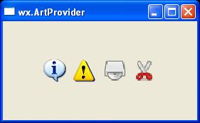
When you need to use standard (i.e., platform-provided) bitmaps, you should take a look at wx.ArtProvider, which is a class used to customize the look of wxPython application.
When wxPython needs to display an icon or a bitmap (e.g. in the standard file dialog), it does not use a hard-coded resource but asks wx.ArtProvider for it instead. A number of standard bitmaps are readily available, and in particular the following:
|
|
|
|
|
|
|
|
|
|
|
|
|
|
|
|
|
|
|
|
|
|
|
|
|
|
|
|
|
|
|
|
|
|
|
|
|
|
|
|
|
|
|
|
|
|
|
|
|
|
|
|
|
In order to use wx.ArtProvider and retrieve a standard bitmap, you may do something like:
bmp = wx.ArtProvider.GetBitmap(wx.ART_INFORMATION, wx.ART_OTHER, (16, 16))
static_bitmap = wx.StaticBitmap(parent, -1, bmp)
Hints
- See the GetBitmap method of wx.ArtProvider and the wx.StaticBitmap constructor.
Exercises
- Using the wx.ArtProvider, a wx.StaticBitmap and a wx.BoxSizer, put 4 standard bitmaps stacked horizontally
- Can you create a sizer/widgets hierarchy for which the 4 bitmaps are always centered in the main application window?
Click on the figure for the solution.
Core Widgets
We will now explore a few of the most frequently used core controls in wxPython. The actual number of core classes (100) is way too big to explore them all in this tutorial, but this introductory overview should get you started and whet your appetite for more...
Common dialogs
Common dialog classes and functions encapsulate commonly-needed dialog box requirements. They are all modal, grabbing the flow of control until the user dismisses the dialog, to make them easy to use within an application.
Some dialogs have both platform-dependent and platform-independent implementations, so that if underlying windowing systems do not provide the required functionality, the generic classes and functions can stand in. For example, under Windows, ColourDialog uses the standard colour selector. There is also an equivalent called GenericColourDialog for other platforms.
wxPython wraps pretty much all the standard dialogs:
- wx.ColourDialog, wx.DirDialog, wx.FileDialog
- wx.FontDialog, wx.PageSetupDialog, wx.PrintDialog
- wx.MessageDialog, wx.ProgressDialog
- wx.FindReplaceDialog, etc...
wx.FileDialog
wx.FileDialog pops up a file selector box. On Windows and GTK 2.4+, this is the common file selector dialog. Looking at its constructor:
- FileDialog.__init__(parent, message=u'Select a file', defaultDir='', defaultFile='', wildcard=u'*.*', style=wx.FD_DEFAULT_STYLE)
Parameters: - parent – Parent window.
- message (string) – Message to show on the dialog.
- defaultDir (string) – The default directory, or the empty string.
- defaultFile (string) – The default filename, or the empty string.
- wildcard (string) – A wildcard, such as ”.” or “BMP files (.bmp)|.bmp|GIF files (.gif)|.gif”.
- style (long) – A dialog style.
The path (defaultDir) and filename (defaultFile) are distinct elements of a full file pathname.
If defaultDir is “”, the current directory will be used. If defaultFile is “”, no default filename will be supplied. The wildcard parameter determines what files are displayed in the file selector, and file extension supplies a type extension for the required filename.
The most common style bits used are wx.FD_OPEN (for a “file open” dialog) and wx.FD_SAVE (for a “file save” dialog).
wx.FileDialog implements a wildcard filter. Typing a filename containing wildcards (*, ?) in the filename text item, and clicking on Ok, will result in only those files matching the pattern being displayed.
The wildcard may be a specification for multiple types of file with a description for each, such as:
wildcard = "BMP files (*.bmp)|*.bmp|GIF files (*.gif)|*.gif"
As an example, to give the user the possibility to choose one Python file in a folder:
# This is how you pre-establish a file filter so that the dialog
# only shows the extension(s) you want it to.
wildcard = 'Python source (*.py)|*.py'

dlg = wx.FileDialog(None, message="Choose a Python file", defaultDir=os.getcwd(),
                    defaultFile="", wildcard=wildcard, style=wx.FD_OPEN)

# Show the dialog and retrieve the user response. If it is the OK response,
# process the data.
if dlg.ShowModal() == wx.ID_OK:
    # This returns the file that was selected
    path = dlg.GetPath()
    print(path)

# Destroy the dialog. Don't do this until you are done with it!
# BAD things can happen otherwise!
dlg.Destroy()
wx.MessageDialog
This dialog shows a single or multi-line message, plus buttons that can be chosen from OK, Cancel, Yes, and No. Under Windows, an optional icon can be shown, such as an exclamation mark or question mark.
It is mostly used as informational message window. As an example, if you want to inform the user that some process in your GUI has finished running, you may do the following:
dlg = wx.MessageDialog(None, message='Calculations finished', caption='Information',
                       style=wx.OK | wx.ICON_INFORMATION)
dlg.ShowModal()
dlg.Destroy()
Hints
- For part (1), see the Append method of wx.Menu
- For part (3) you may need to look at the SetValue method of wx.TextCtrl
- See also the official Python docs on I/O, wx.FileDialog and wx.MessageDialog constructors.
Exercises
Using the Widgets sample:
- Add a new “Open...” menu item in the “File” menu
- Upon user selection of this menu, launch a wx.FileDialog to let the user choose a Python file
- Read the Python file and set its content as text in the text control
- Inform the user that the file has been loaded successfully via a wx.MessageDialog.
Click on the figure for the solution.
Common widgets
In this section we are going to explore a few of the most commonly used widgets – although not the basic ones such as wx.ComboBox or wx.SpinCtrl.
wx.Notebook
This class represents a notebook control, which manages multiple windows with associated tabs.
To use the class, create a wx.Notebook object and call AddPage or InsertPage, passing a window to be used as the page.
As an example, this is how you may add a tabbed page to your notebook control:
notebook = wx.Notebook(parent)

# Create the page windows as children of the notebook
page = wx.Panel(notebook)

# Add the pages to the notebook with the label to show
# on the tab
notebook.AddPage(page, 'Page 1')
Hints
- See the AddPage method of wx.Notebook
- Don’t forget that any page you add must be a child of the notebook, i.e. the notebook itself should be the parent parameter for the widget that will become a page in the notebook
Exercises
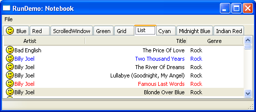
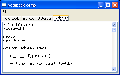
Using the Notebook sample:
- Look for the OnOpen menu event handler
- Modify the OnOpen method to create a wx.TextCtrl and add the text ctrl as a new page in the notebook: the text control will display the content of the Python file selected in the OnOpen method
- Set the notebook tab text to be the filename (without the directory information or file extension)
- Set the notebook style to show tabs at bottom instead of at top
Click on the figure for the solution.
wx.SplitterWindow
This widget enables to split the main area of an application into parts. The user can dynamically resize those parts with the mouse pointer. Such a solution can be seen in mail clients or in burning software. You can split an area vertically or horizontally.
As an example on how to use it:
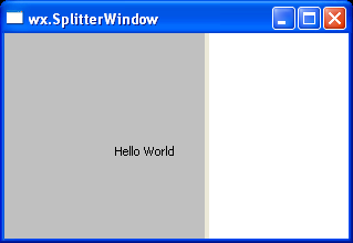
import wx

class SplitterFrame(wx.Frame):

    def __init__(self):

        wx.Frame.__init__(self, None, title='wx.SplitterWindow')

        splitter = wx.SplitterWindow(self, -1)
        panel1 = wx.Panel(splitter, -1)

        static = wx.StaticText(panel1, -1, 'Hello World', pos=(100, 100))
        panel1.SetBackgroundColour(wx.LIGHT_GREY)

        panel2 = wx.Panel(splitter, -1)
        panel2.SetBackgroundColour(wx.WHITE)

        splitter.SplitVertically(panel1, panel2)
        self.Centre()
Hints
- See the SplitterWindow constructor and its window styles
- You may want to use different background colours for the split windows to make them more visible
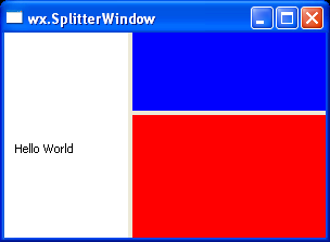
Exercises
Using the Splitter sample:
- Modify it to make a “split-split” window, i.e., a window split vertically which contains 2 windows split horizontally.
- Looking at the wx.SplitterWindow window styles, can you make their sash to update “live”?
Click on the figure for the solution.
wx.TreeCtrl
A tree control presents information as a hierarchy, with items that may be expanded to show further items. It is implemented natively on Windows and it uses a generic implementation on GTK and Mac OS, although newer versions of wxPython (the 2.9 ones) provide a native implementation in DataViewTreeCtrl.
There is also a pure-Python implementation (with many more functionalities) in wx.lib, termed CustomTreeCtrl.
A simple application showing the usage of wx.TreeCtrl is as follows:
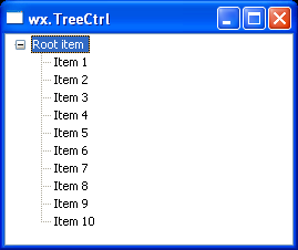
import wx

class TreeFrame(wx.Frame):

    def __init__(self):

        wx.Frame.__init__(self, None, title='wx.TreeCtrl')

        tree_ctrl = wx.TreeCtrl(self, -1, style=wx.TR_DEFAULT_STYLE)

        # Add the tree root
        root = tree_ctrl.AddRoot('Root item')

        for i in range(10):
            tree_ctrl.AppendItem(root, 'Item %d'%(i+1))

        tree_ctrl.ExpandAll()
        self.Centre()
Hints
- See the TreeCtrl constructor and its window styles
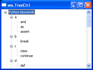
Exercises
Using the TreeCtrl sample and the Python keyword module:
- Classify the Python keywords alphabetically, using the first letter of the keyword
(i.e., and goes into a, for goes into f and so on):
- For each letter, add a child to the treectrl root
- In each child of the root item, add its corresponding keyword(s)
- Looking at the wx.TreeCtrl window styles, can you make the selection highlight extend over the entire horizontal row of the tree control window? How do you make the selection editable?
Click on the figure for the solution.
Creating Custom Controls - Basics
In this section, we are going to look at few generalities about custom controls and how to draw custom objects on some wxPython windows. Unfortunately the entire “owner-draw” subject is way too big to be covered during a short tutorial, but this section should at least get you started and whet your appetite for more.
(If you want to hear more details, please feel free to contact me at any time during the PythonBrasil8 conference).
Device contexts and paint events
A DC is a device context onto which graphics and text can be drawn. It is intended to represent different output devices and offers a common abstract API for drawing on any of them.
DCs have many drawing primitives:
- DrawBitmap, DrawEllipse, DrawLine, DrawLines, DrawPoint, DrawPolygon, DrawRectangle, DrawRoundedRectangle, DrawSpline, DrawText, etc...
And they work with GDI objects:
- wx.Font, wx.Bitmap, wx.Brush, wx.Pen, wx.Mask, wx.Icon, etc...
Some device contexts are created temporarily in order to draw on a window. This is true for some of the device contexts available for wxPython:
- ScreenDC: Use this to paint on the screen, as opposed to an individual window.
- ClientDC: Use this to paint on the client area of window (the part without borders and other decorations), but do not use it from within an PaintEvent.
- PaintDC: Use this to paint on the client area of a window, but only from within a PaintEvent.
- WindowDC: Use this to paint on the whole area of a window, including decorations. This may not be available on non-Windows platforms.
Let’s focus on the PaintDC, which is one of the most commonly used. To use this device context, we want to bind a paint event for a window to an event handler, which will be responsible for drawing (almost) anything we want onto our window:
Documentation
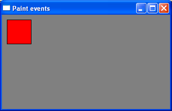
class MainWindow(wx.Frame):

    def __init__(self, parent, title):

        wx.Frame.__init__(self, parent, title=title)

        # Bind a "paint" event for the frame to the
        # "OnPaint" method
        self.Bind(wx.EVT_PAINT, self.OnPaint)
        self.Show()


    def OnPaint(self, event):

        dc = wx.PaintDC(self)

        # Set a red brush to draw a rectangle
        dc.SetBrush(wx.RED_BRUSH)
        dc.DrawRectangle(10, 10, 50, 50)
The PaintEvent is triggered every time the window is redrawn, so we can be sure that our red rectangle will always be drawn when the operating system wants to “refresh” the content of our window.
Similar things can be done using other graphical primitives, like DrawPoint:
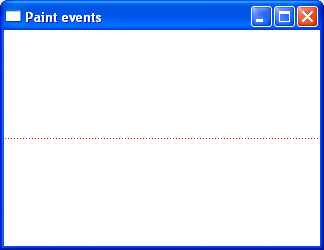
def OnPaint(self, event):

    dc = wx.PaintDC(self)

    # Use a red pen to draw the points
    dc.SetPen(wx.Pen('RED'))

    # Get the size of the area inside the main window
    w, h = self.GetClientSize()
    # Draw a sequence of points along the mid line
    for x in range(1, w, 3):
        dc.DrawPoint(x, h/2)
Documentation
Or drawing text strings onto our window by using DrawText:
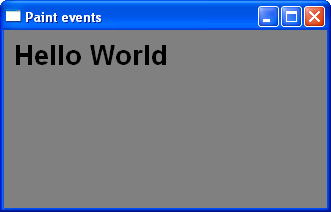
def OnPaint(self, event):

    dc = wx.PaintDC(self)

    # Use a big font for the text...
    font = wx.Font(20, wx.SWISS, wx.NORMAL, wx.BOLD)
    # Inform the DC we want to use that font
    dc.SetFont(font)

    # Draw our text onto the DC
    dc.DrawText('Hello World', 10, 10)
Hints
- See the DrawLine, the DrawText and the GetFullTextExtent methods.
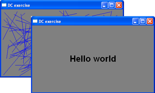
Exercises
Modify the DC sample such that:
- Using the random module, draw a number (let’s say 100) of random lines inside the wx.Frame client area.
- Looking at the previous snippets of code which uses DrawText, and using the width and height returned by the DC.GetFullTextExtent method, can you draw a string centered in the frame client area?
Click on the figure for the solution.
Additional resources and tutorials
- The ZetCode tutorial on drawing
- Creating custom control with wxPython Wiki page